Creative Office of
JOSHUA GAJOWNIK

The Jubala identity expresses a dichotomy – looking up, celebrating each day’s small gifts and looking down, acknowledging a coffee’s origins – which permeates both the café and roasting brands.
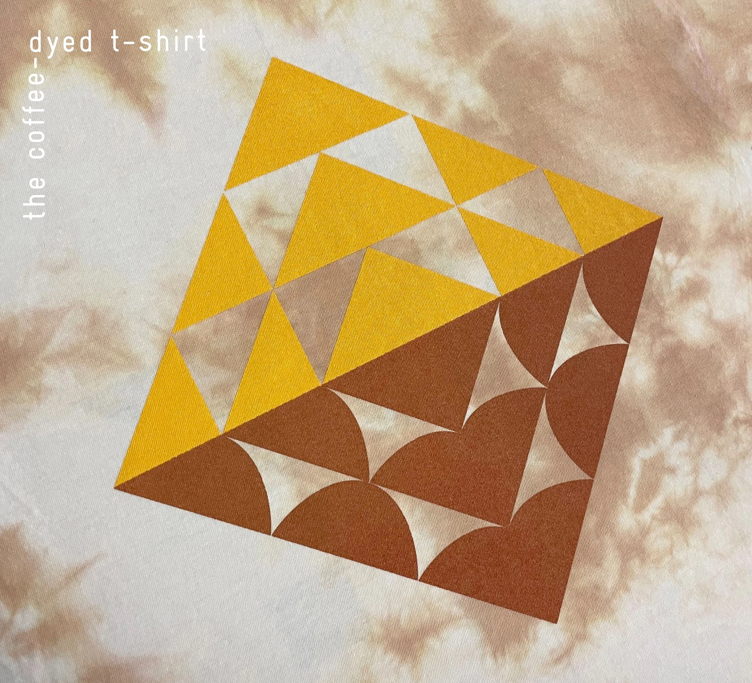
Collected coffee grounds from the shops become custom tie-dye shirts with Rise & Ramble. Printing by AH Peele.
“Coffee blooms” conveys a sense of life to the beans. Over and over again, coffee blooms when it is grown, harvested, processed, roasted, and brewed with intention, ultimately creating something worth celebrating.
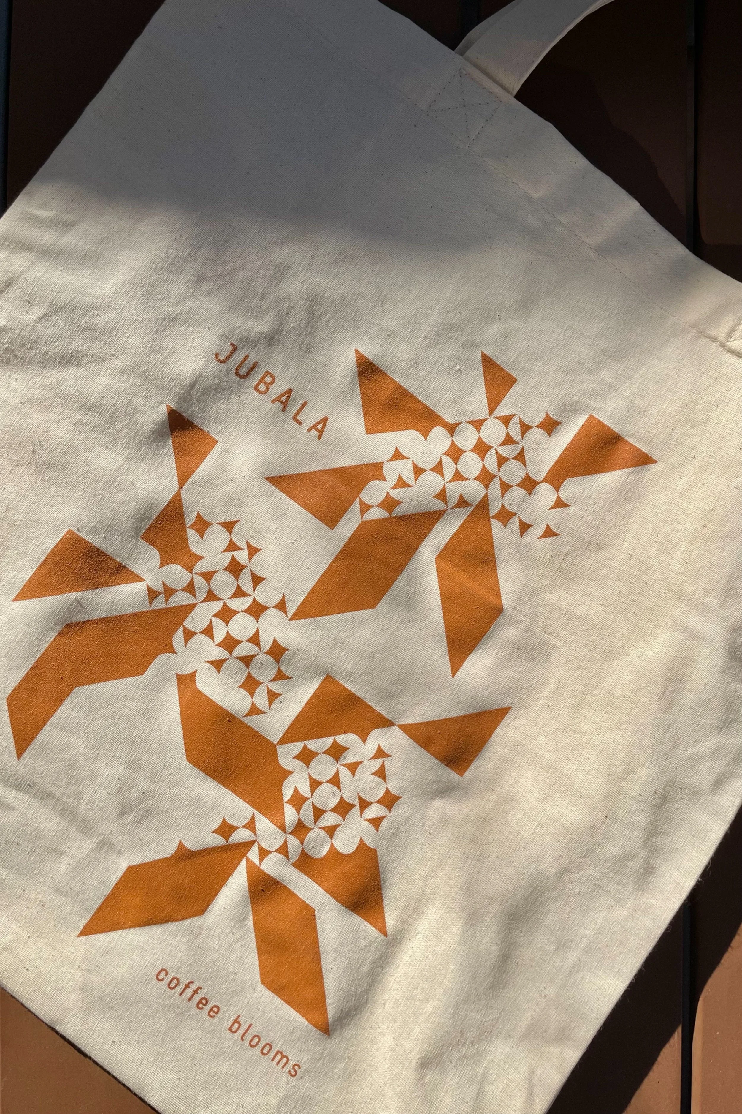
Together the two parts of the logo create a balanced symbol. Painting by SPCLSigns.
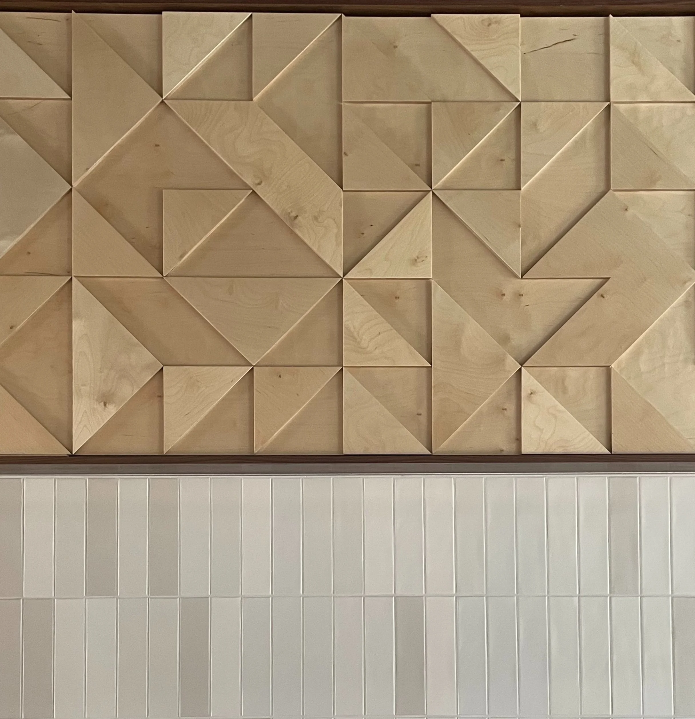
The geometry of the logo is expressed throughout the café spaces, here in relief, adding depth to a muted, earthy material palette.
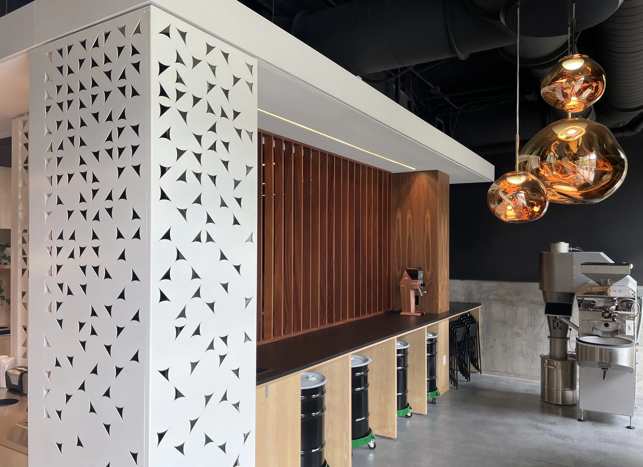
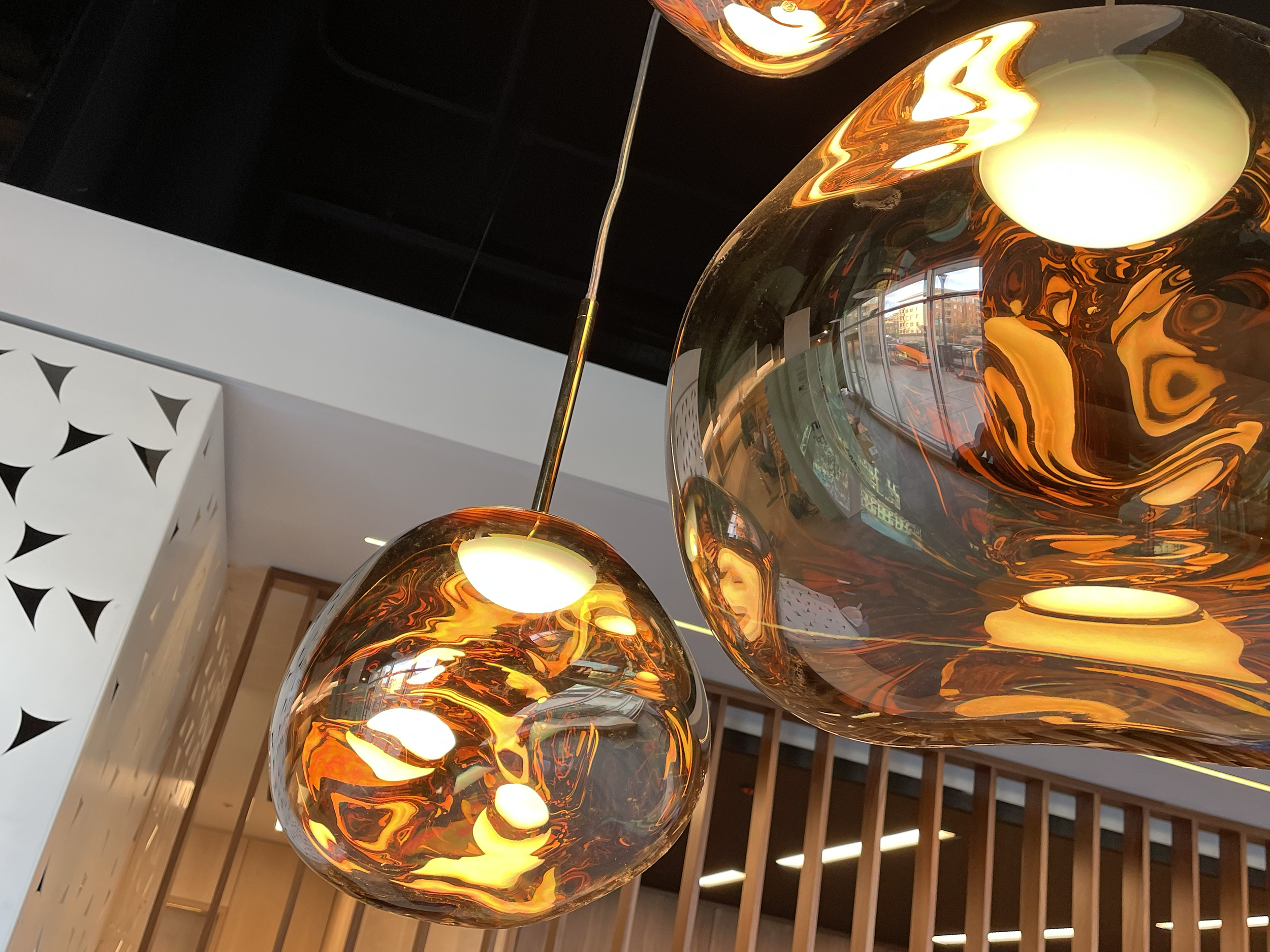
At Jubala’s third shop molten-like Tom Dixon pendants hang over the stainless roaster in a dramatic moment. Architecture by InSitu.

A subtle transition from scallops to triangles wraps a steel screen. Fabrication by Tactile Workshop.
The contrast of structured geometry and rhythms to amorphous organic shapes informs the roasting brand.
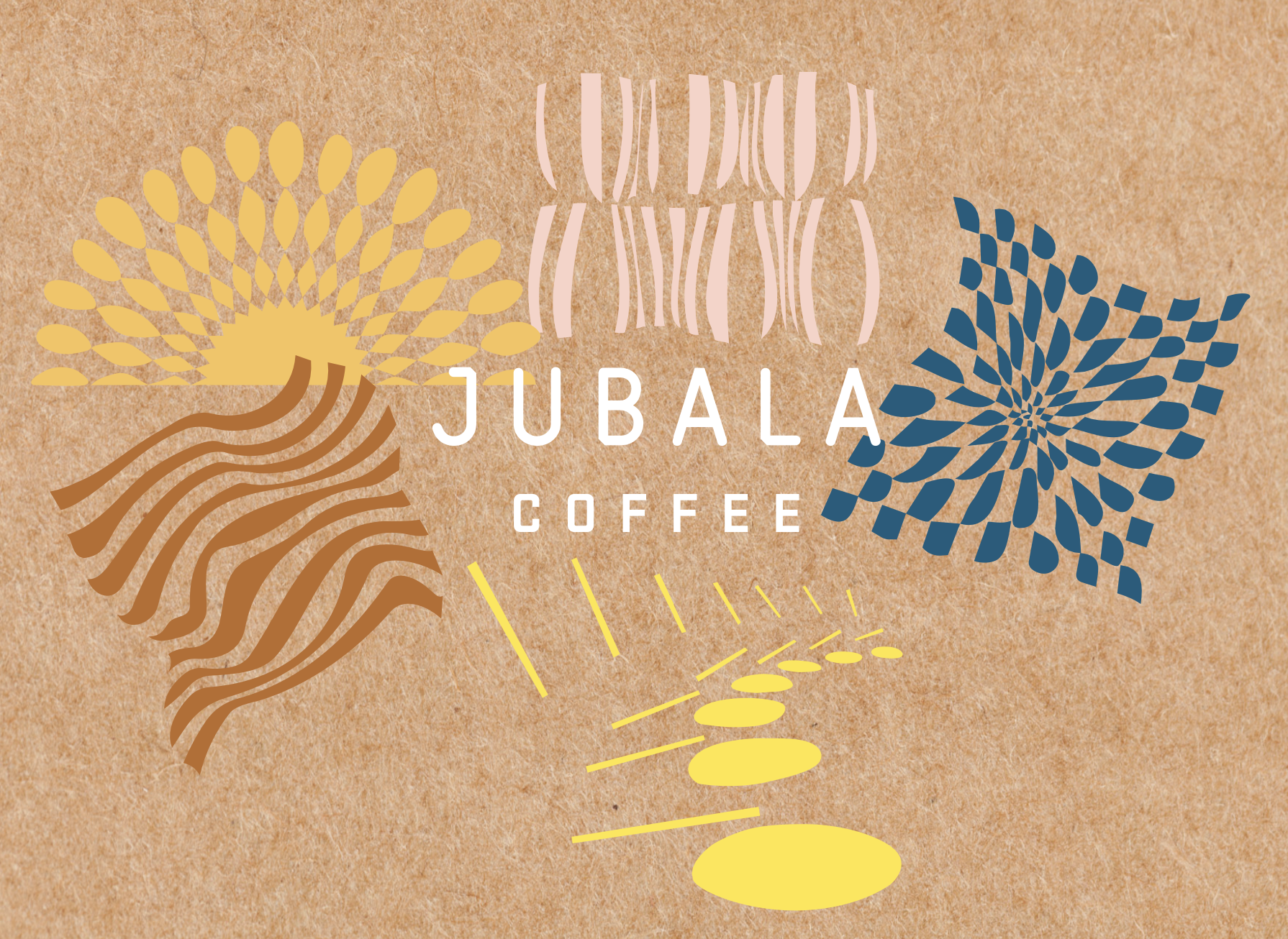
Moving into packaging (in prog), graphic motifs become more fluid expressing a sense of movement and jubilance.
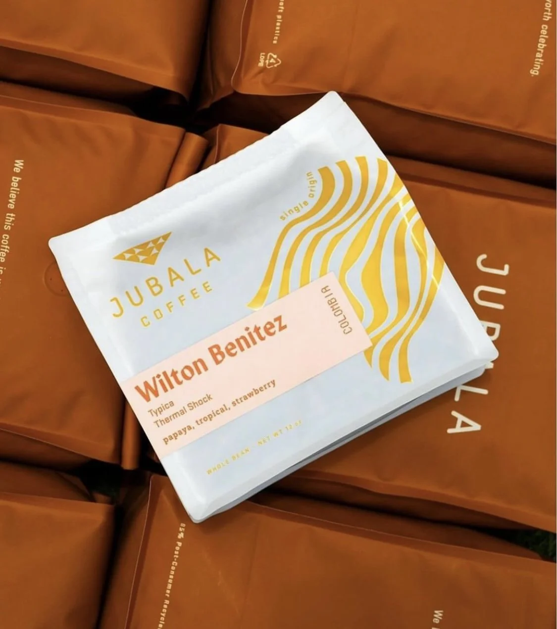
Photo by Kyle Hamlin
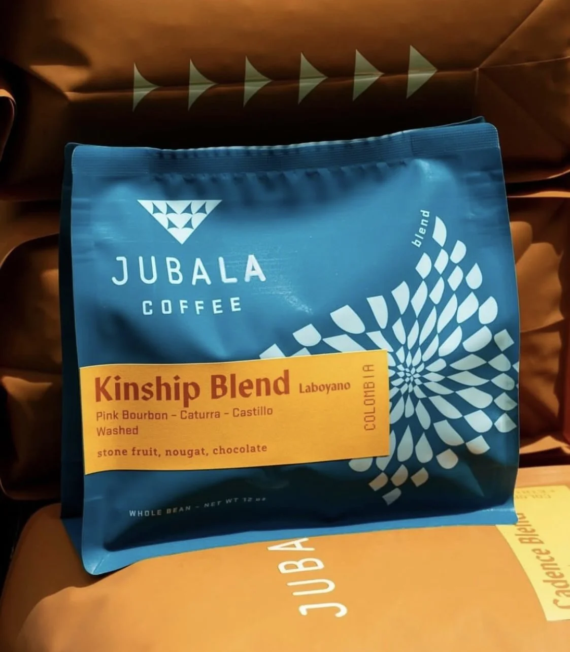
Photo by Kyle Hamlin